Forex Charts – Introduction to Forex Charting
A brief introduction to Forex charting:
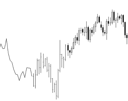 The following article will give you a very basic introduction into the world of Forex charting. It is designed for people with no prior charting knowledge and also for those who would like a quick reference guide or a refresher on the basic chart types that we use in Forex. Since reading charts is the basis of what we do here at Learn To Trade The Market, we need to start from a solid foundation and get the basics of charting out of the way. This material will give you the necessary information you will need to make sense out of all the other information on my website as well as my Forex trading course. So let’s get started with your first Forex trading lesson…
The Line Chart:
Even if you have no previous experience or knowledge of trading the markets you have probably seen a line chart of price on the nightly news or in a text book at some point. A line chart gives you a good snapshot of market direction by connecting a line from one closing price to the next (You can set them to show open, high or low prices too, but the closing price is most popular). Most traders put a greater emphasis on the closing price of any trading instrument, so the line chart can give you a meaningful view of market movement over a period of time.
Here is what a line chart looks like:
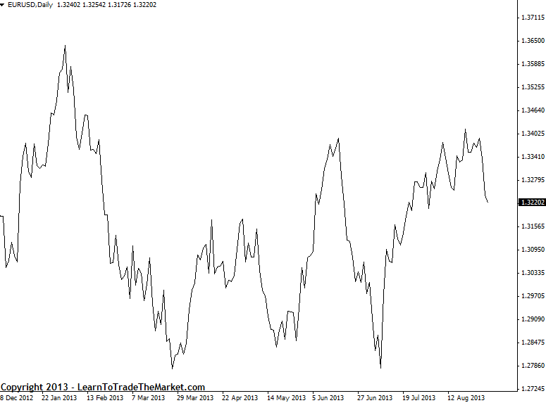
As you can see from the line chart above, the recent trend on the daily for EUR/USD is up although currently is in the midst of a downward correction and has been range-bound overall this year. Zooming out and looking at a daily or weekly line chart can give you a good idea of dominant trend direction. It is very easy to get stuck looking at 1hour or lower charts which inherently have a lot of “noise” or useless information, line charts can give you a good longer term perspective to help keep you grounded. My Forex trading course mainly uses candlestick charts which are the most popular charts and the ones you will encounter the most. We will cover candlestick charts after bar charts below…
The Bar Chart:
A bar chart shows the closing price as well as the open, high, and low price for the time period you are looking at. The top of the vertical bar indicates the highest price paid during that time period while the bottom of the bar indicates the lowest price paid during that time period. The entire length of the bar from top to bottom thus indicates the range of price over the time period you are looking at. You will notice that each individual bar also has a hash on the left and a hash on the right side of the bar. The hash on the left side indicates the opening price during that time period, the hash on the right side indicates the closing price for that time period.
NOTE: A bar is simply one segment of time, whether it is one day, one week, or one hour. Bar charts are also called “OHLC” charts, because they indicate the Open, the High, the Low, and the Close for that particular currency.
Here’s an example of a price bar:
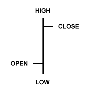
Open: The little horizontal line on the left is the opening price
High: The top of the vertical line defines the highest price of the time period
Low: The bottom of the vertical line defines the lowest price of the time period
Close: The little horizontal line on the right is the closing price
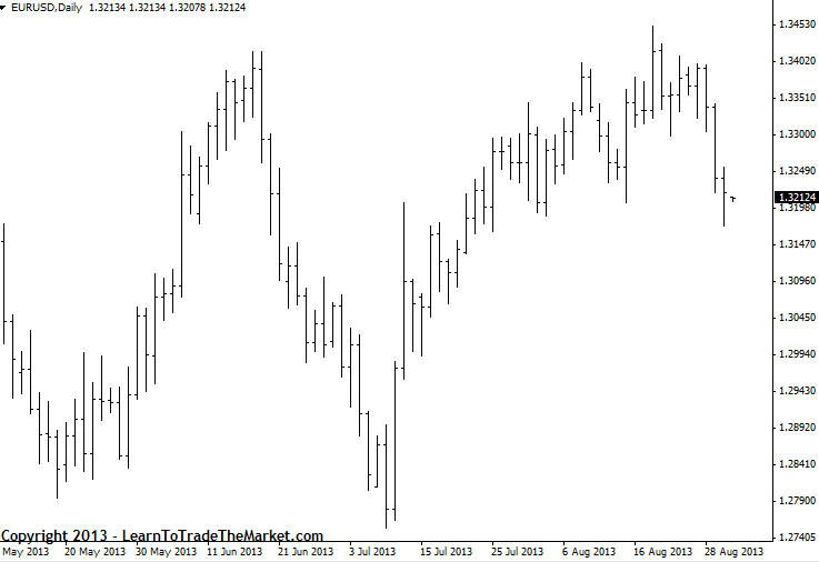
Here is the same chart used in the line chart explanation but in bar chart form:
Candlestick charts:
Candlestick charts show the same information as a bar chart but in a graphical format that is more fun and useful to look at.
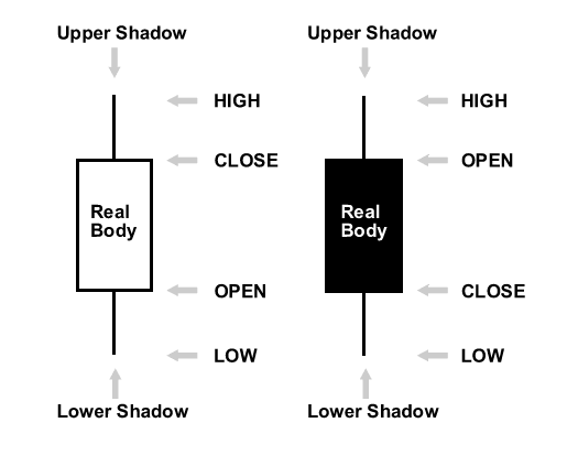
Candlestick charts indicate the high and low of the given time period just as bar charts do, with a vertical line. The top vertical line is called the upper shadow while the bottom vertical line is called the lower shadow; you might also see the upper and lower shadows referred to as “wicks”. The main difference lies in how candlestick charts display the opening and closing price. The large block in the middle of the candlestick indicates the range between the opening and closing price. Traditionally this block is called the “real body”. Generally if the real body is filled in, or solid / darker in color the currency closed lower than it opened, and if the real body is left unfilled, or usually just white / light colored, the currency closed higher than it opened. So if the real body is solid in color than the top of the real body indicates the open price and the bottom of the real body indicates the closing price. If the real body is unfilled or usually white, the top of the real body indicates the closing price and the bottom indicates the open price. This will all become clearer with an illustration…
Here’s an example of a candlestick price bar:
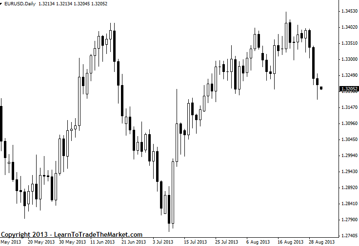
Here is the same chart used in the line and bar chart explanations but in candlestick chart form:
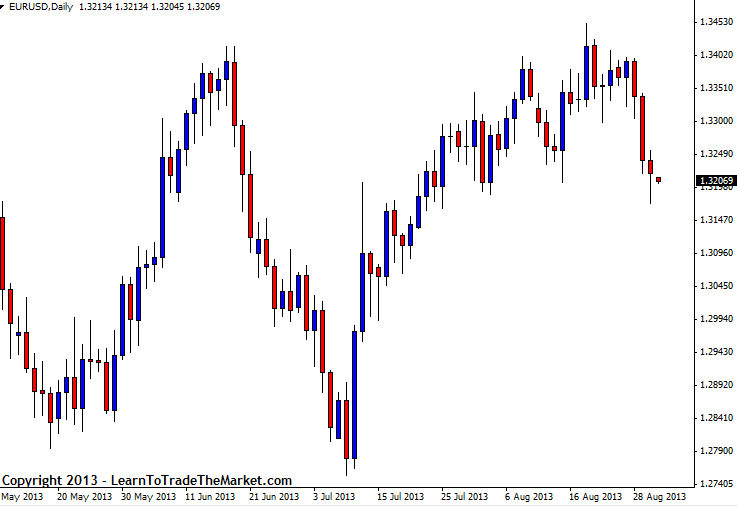
By changing the color on your candlestick chart it can make it easier and more appealing to look at, red and blue are often used as alternate colors, however, I prefer black and white and you will see most charts on my website in black and white. Here we have substituted blue for the white candlestick and red for the black candlestick. In other words, blue is a bull candle (meaning the close was higher than the open), and red is a bear candle (meaning the close was lower than the open).
Candlesticks are probably the most popular of all three chart forms among traders because they are visually easier on your eyes and they allow you to more easily catch signals and trends. My forex trading course mainly uses candlesticks and I suggest all of my students use them. Ultimately it is your decision, but I feel they make learning about price action much easier and more relaxing on the eye and the brain.
You may ALSO be interested in the following lessons …
- Get the correct New York close Candlestick Charts here
- Forex Candlestick Charts
- Forex Japanese Candlestick Patterns
- Price Action Forex Trading


Just entered the world of Forex and I find your explanations very easy and informative. Thank you!
Dear Nial
It is real “Glimpse of the transcendental world”
It is very perfect matching with some mathematics and stage is reached
positive communication with the self.
Regards
Sanjay Pradhan
Pune(India)
I find it easy to understand your explanation and am thankful for the knowledge that you have imparted. Thank you, Nial.
Omar Bin Ali
SERIOUSLY YOUR LESSONS WAS VERY GOOD, I DON’T HAVE MORE TIMES TO LEARN ABOUT CHARTS NOW YOUR LESSONS HAVE PERMITS ME TO GET SOME EXPERIENCE ABOUT CHARTS.THANK YOU…
I love your explanation,it so easy and simple.thanks Nial.
Hi Nial Fuller,
You are doing an excellent job! Your website have complete details about forex market/trading.
Thanks
Varghese Thoppil
Great information. Your videos are so easy to understand. Thanks Nial
Brilliant and clear lessons.Ive always appreciated candlesticks in price action Forex trading.Thanks Nail.Ive traded as per yo lessons and made profits
Thanks for this lesson! The candlesticks are really easy to understand and follow.
these teaching is absolutely brialliant and well simplied for practical action.
Easy and very clear for the newbies :)
great comments actually i am working in pakistan as a senior financial consultant
your techniques is very good.